PORTFOLIO
Emely Silva

Client Details
Client: Sigue Corp.
Category: Logo Design
Date: 2020-2021
Category: Logo Design
Date: 2020-2021
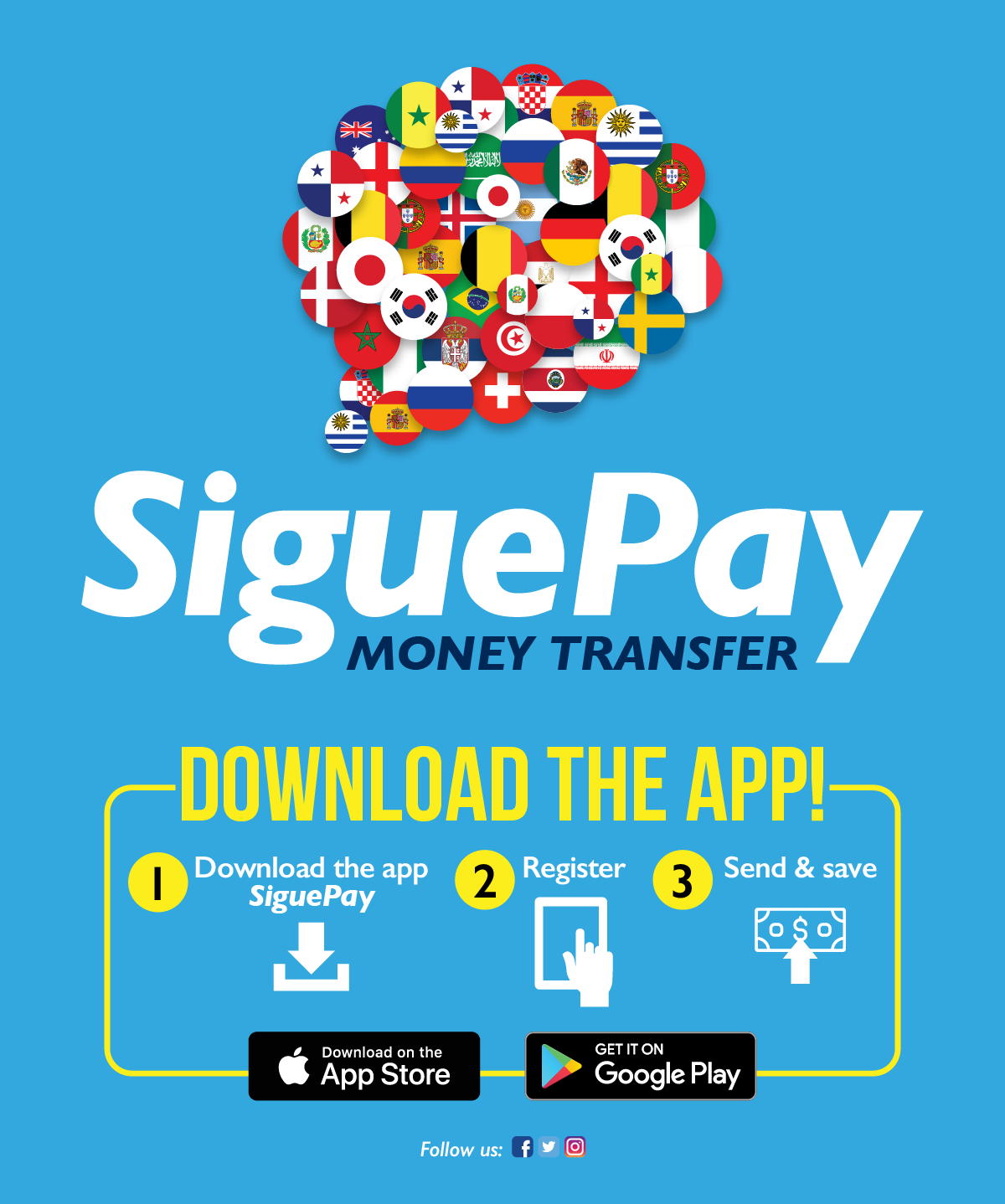
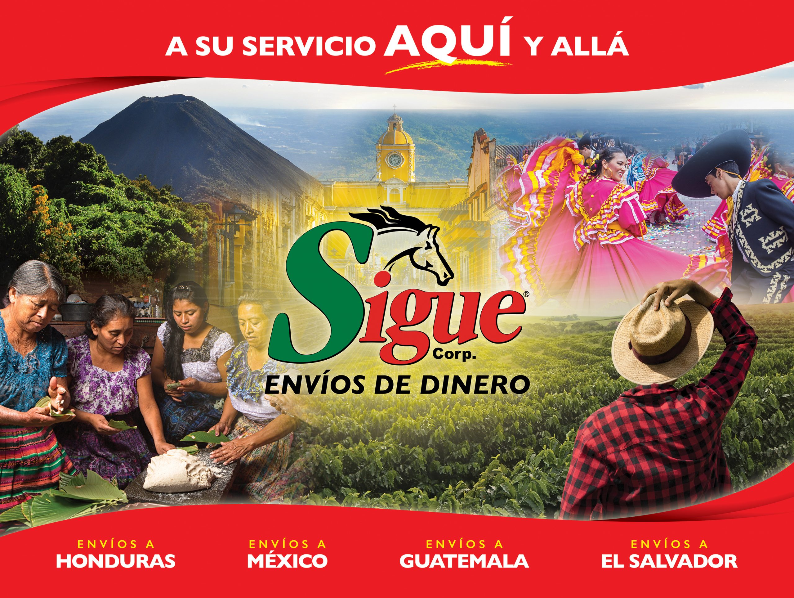
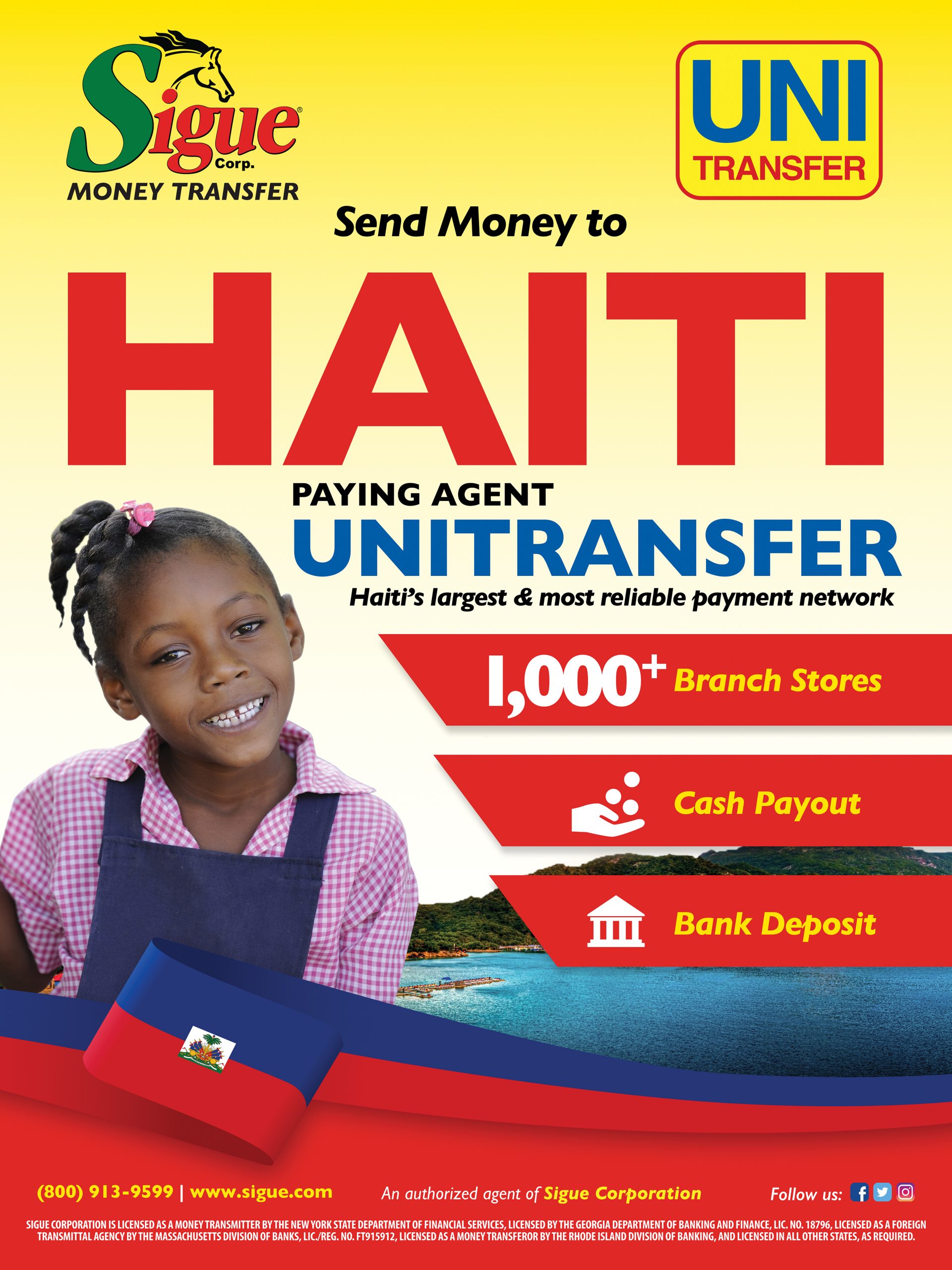
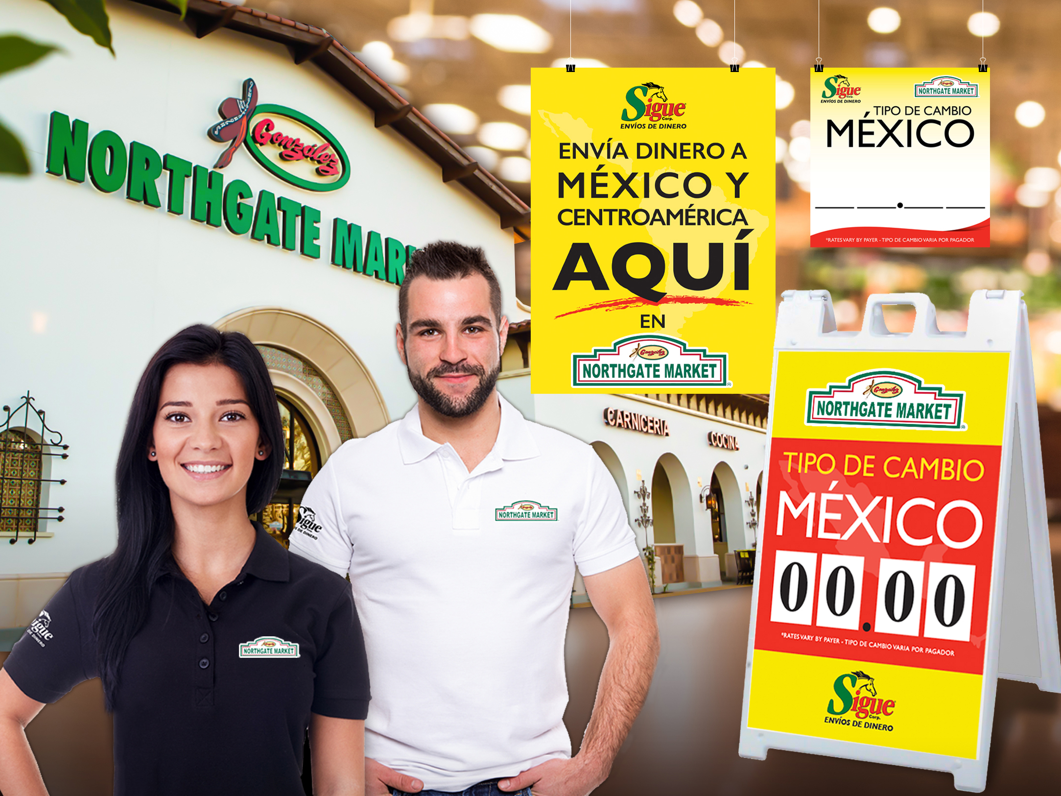
With an increasingly expanding network Sigue decided this was the perfect opportunity to consolidate all its subsidiary entities into one. The goal for this redesign was to encompass a global, inclusive, and friendly modern identity. The Sigue brand is commonly identified by the popular horse icon, a key element to the redesign.
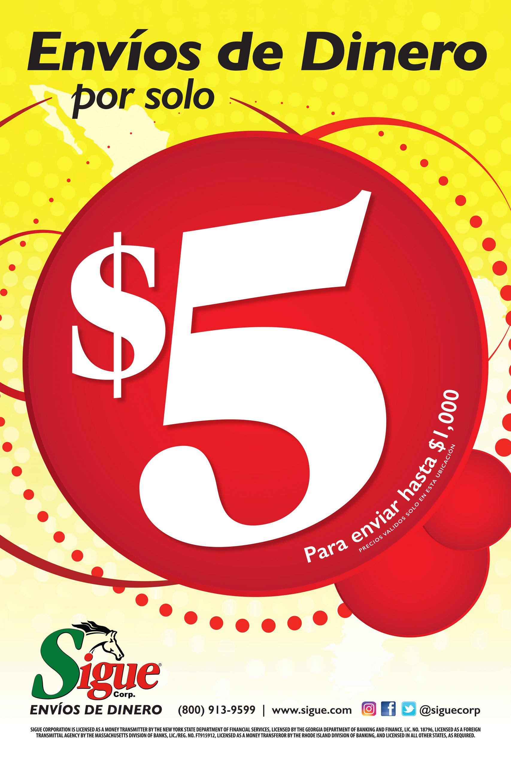
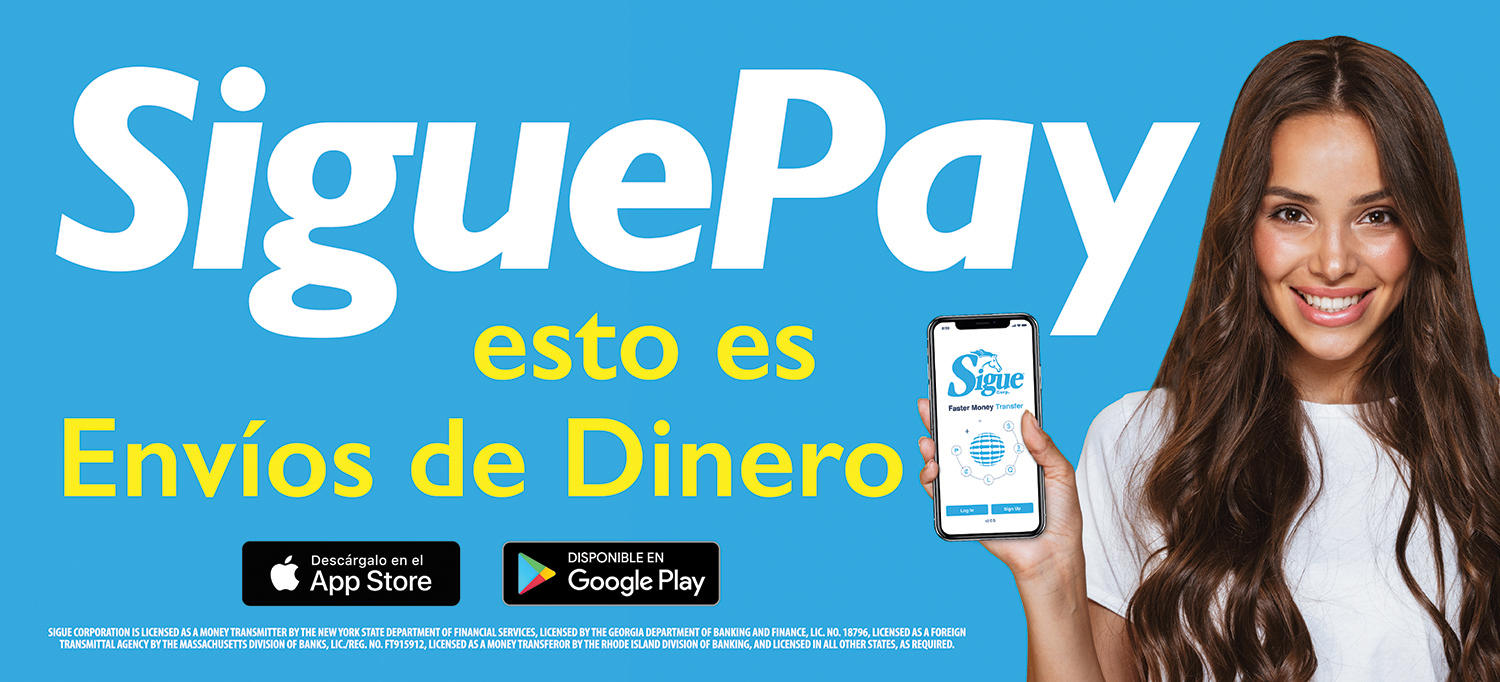
Below you will find a summary of an expanding collateral.
Previous Subsidiaries


additional samples